Before, After, & Lessons Learned: Hilltop
I’ve set up and staged roughly 20 short-term rentals, but y’all, this one almost did me in.
Normally our homeowners take on the responsibility of renovations that we’ve recommended, but the scope of this particular project included managing an entire paint job, 3 bathroom remodels, and THEN outfitting the home.
We didn’t really have the team to handle the renovations, but we knew we would figure it out and treat it as if it were our own. Fast forward through many months of endless contractors and we FINALLY made it. Even though we’ve remodeled homes for over 20 years, we made mistakes along the way and this project was one of those humbling experiences.
Ultimately, though, we’re extremely happy with how it turned out, and this home is quite special, as 100% of the profits will be given to an international organization that provides humanitarian aid. It’s a home that gives back!
Here’s how we transformed the home into a stylish short-term rental.
Overall Design Plan
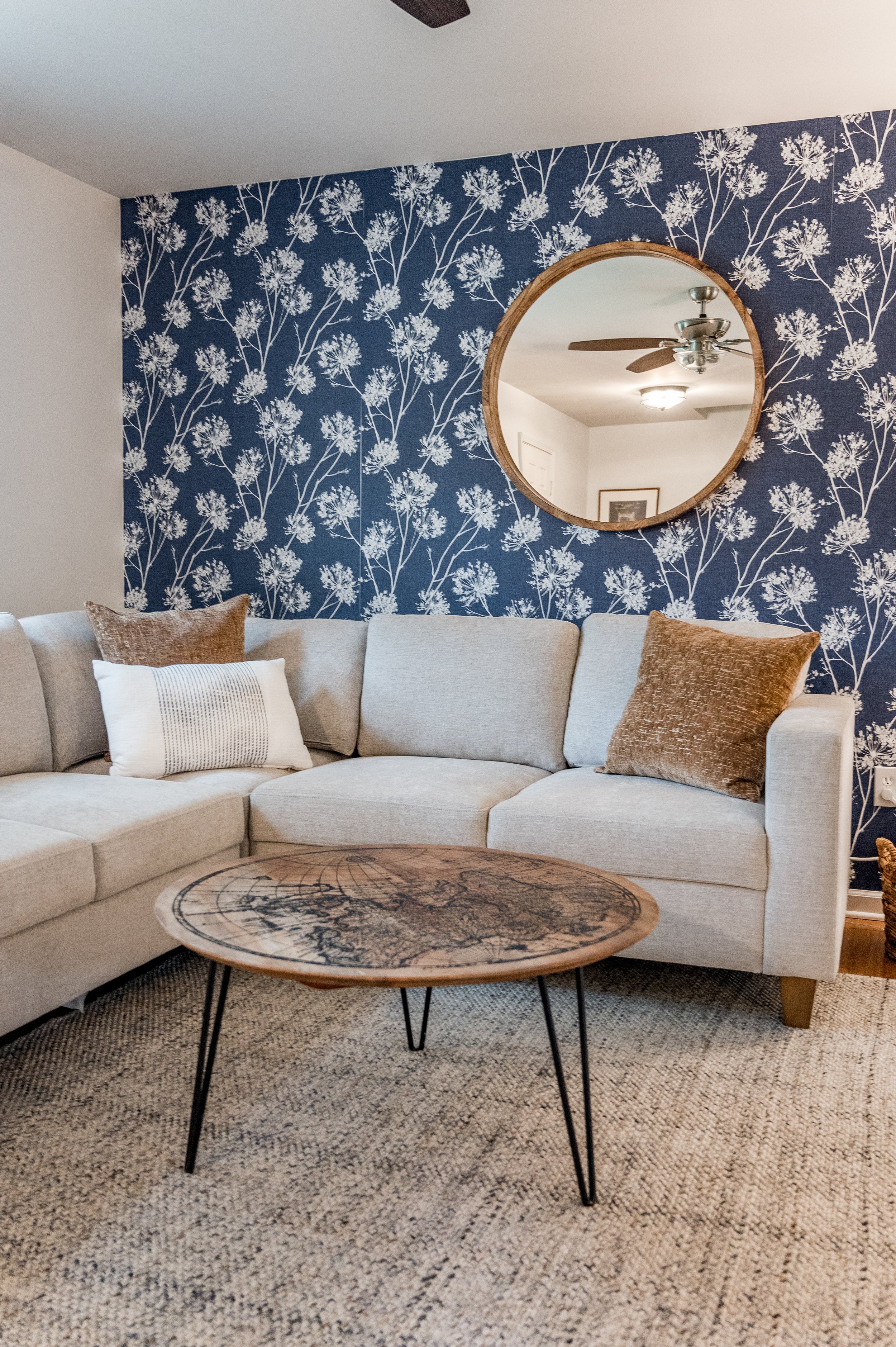
Since the mission of the home is international humanitarian aid, I wanted to subtly bring in many shades of brown to represent various skin tones. (Being true to our name “All Belong,” I always bring an element of diversity into my designs.) And because the home doesn’t have any interesting architectural features, I it was important to bring visual interest by adding wallpaper accent walls. (Little did I know how evil peel-and-stick wallpaper could be…)
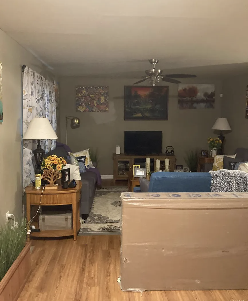
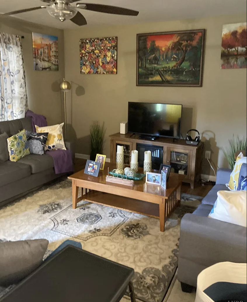
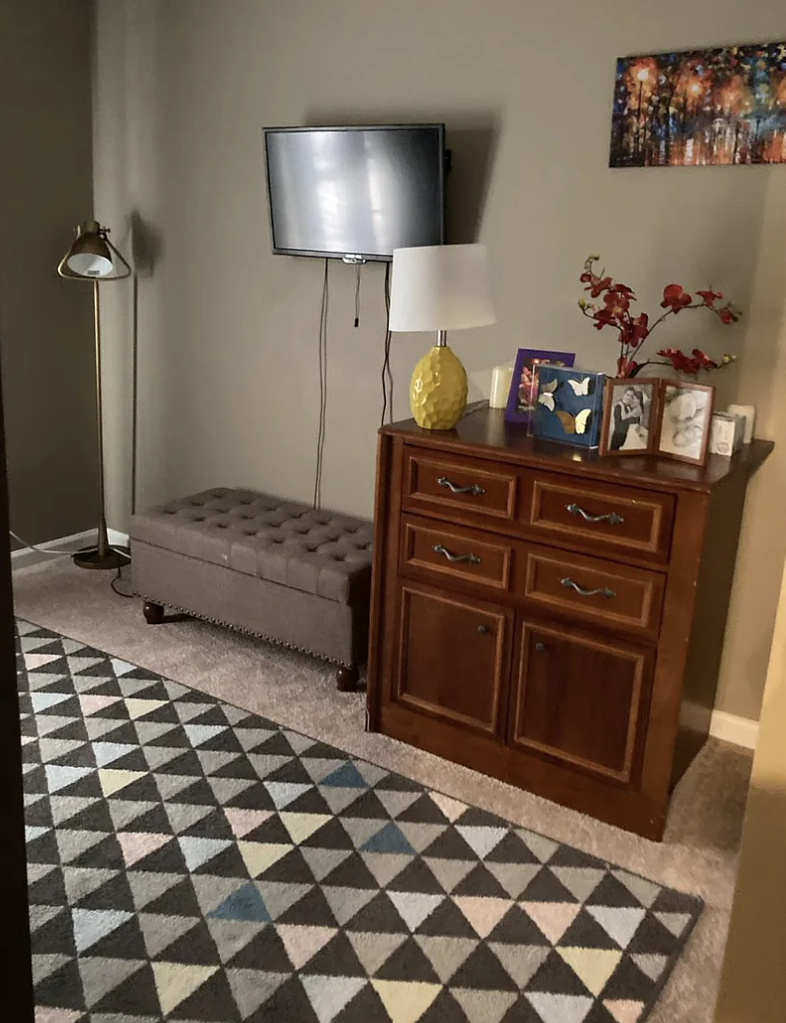
Painting the walls white really brightened the space AND made the wallpaper stand out. I also changed the seating and TV layout to open up the room and make it feel more spacious.
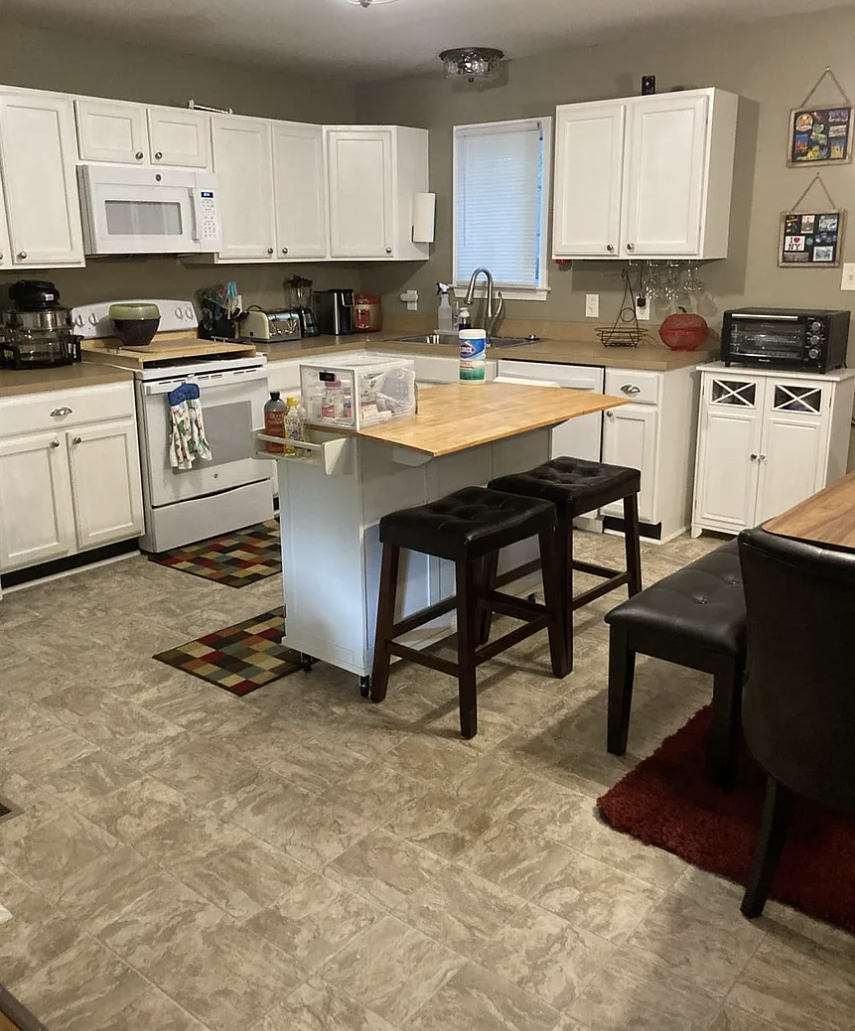
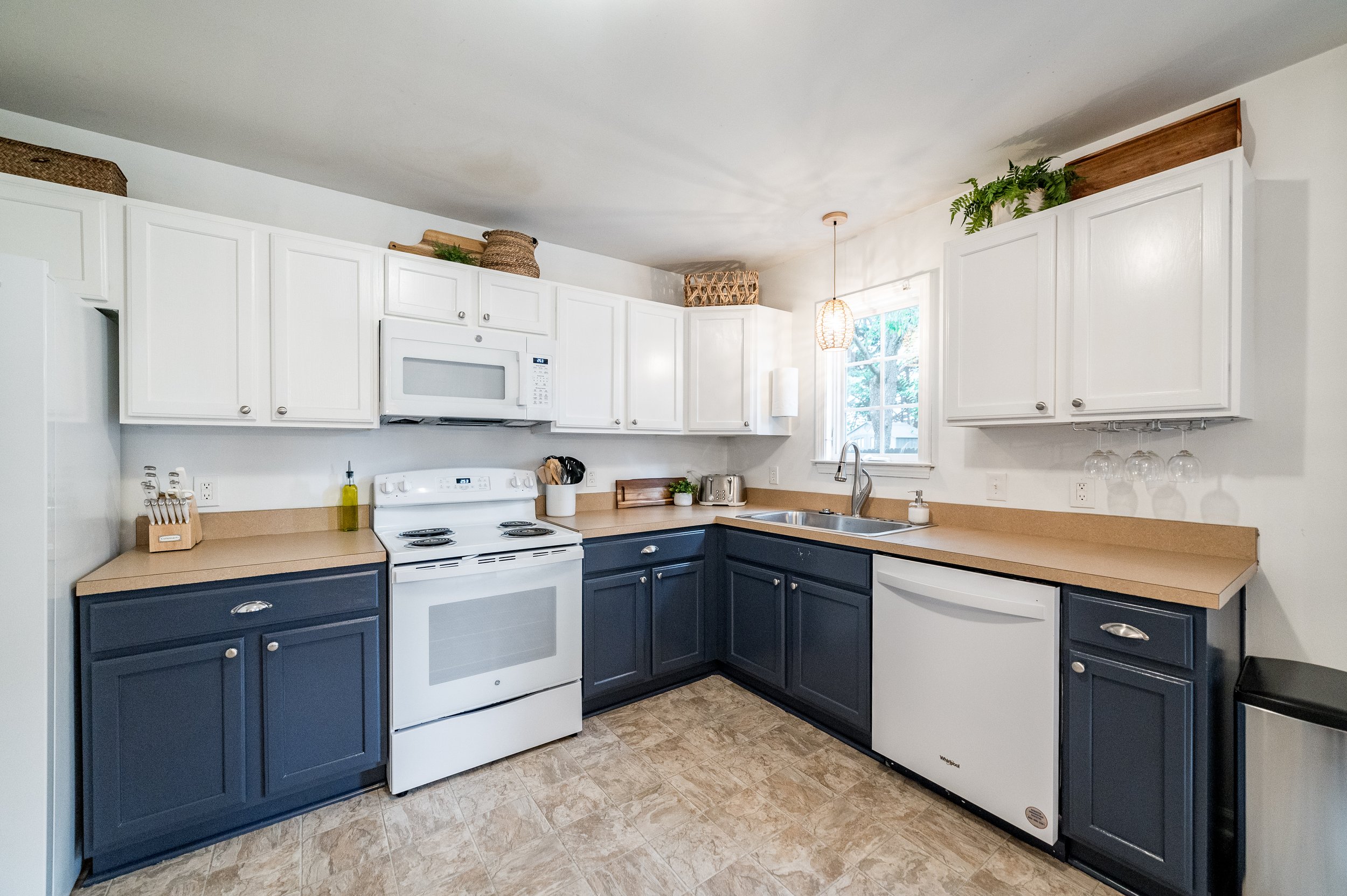
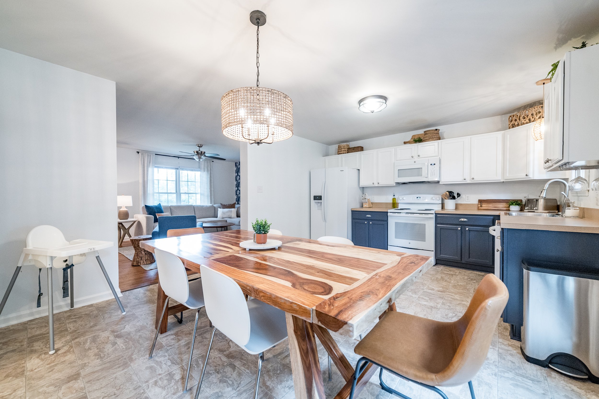
Was this the HGTV kitchen of my dreams? No. And the budget wasn’t going to allow us to replace the almost-new appliances. I hated the brown laminate countertop and outdated laminate flooring, but again, BUDGET. So I came up with a solution to make the brown laminate resemble butcher block countertops"; by painting the lower cabinets dark, it allowed the walls and upper cabinets to disappear, drawing the eye upward by placing various baskets above the cabinets.
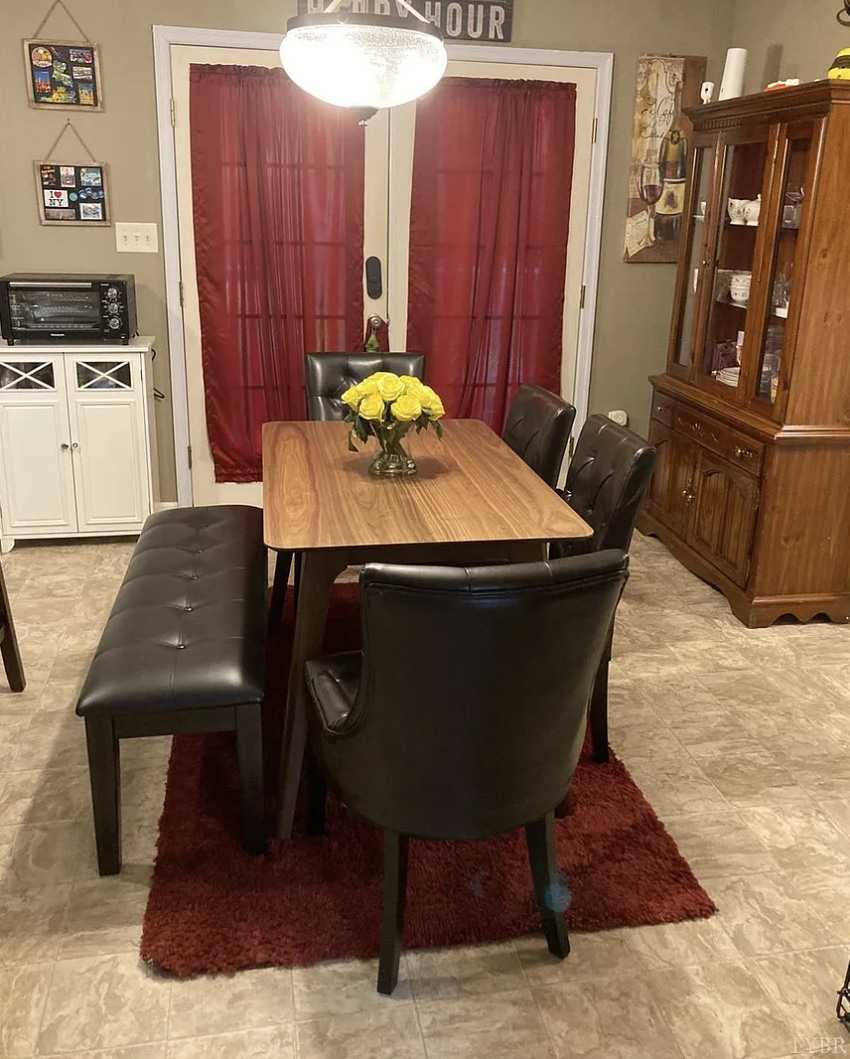
Everything in the former dining room was dark and heavy. It just needed to breathe and let the light in.
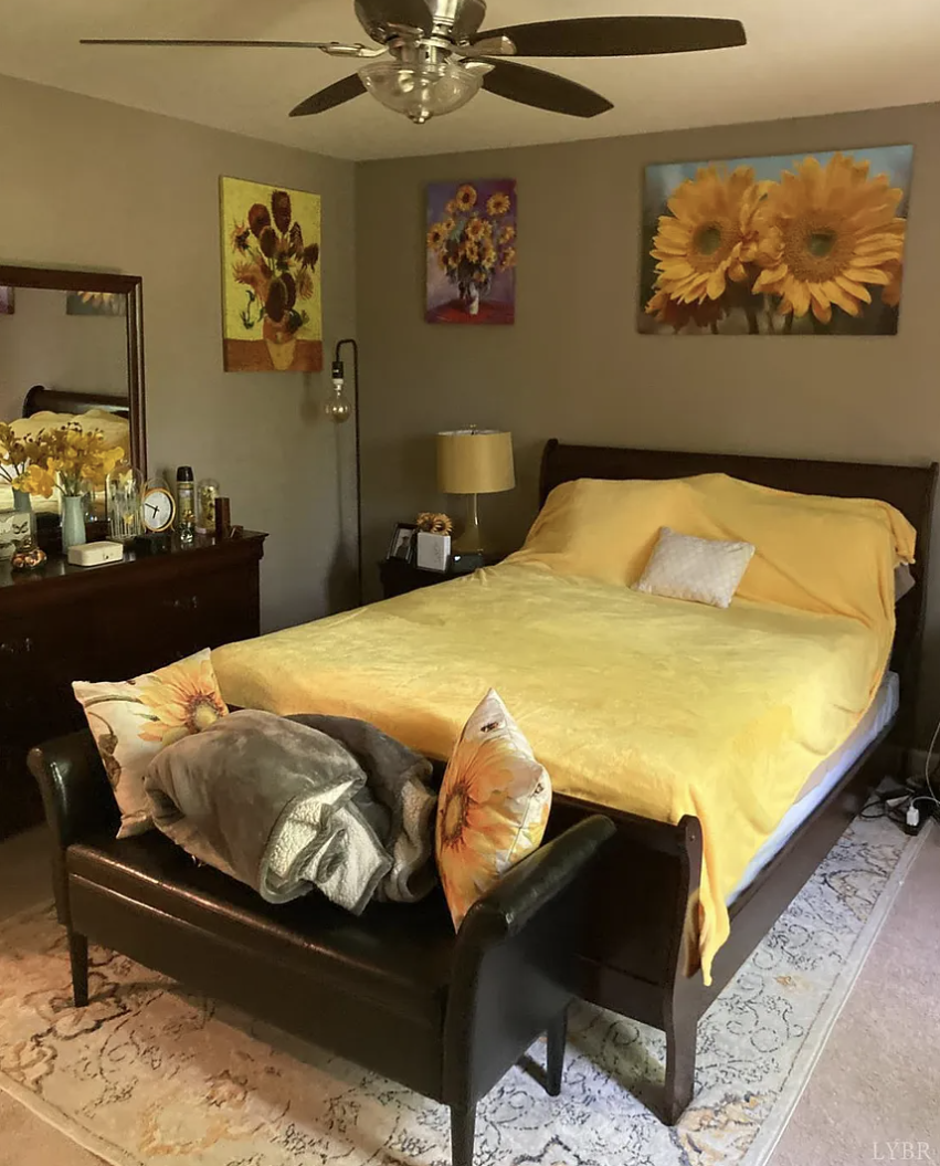
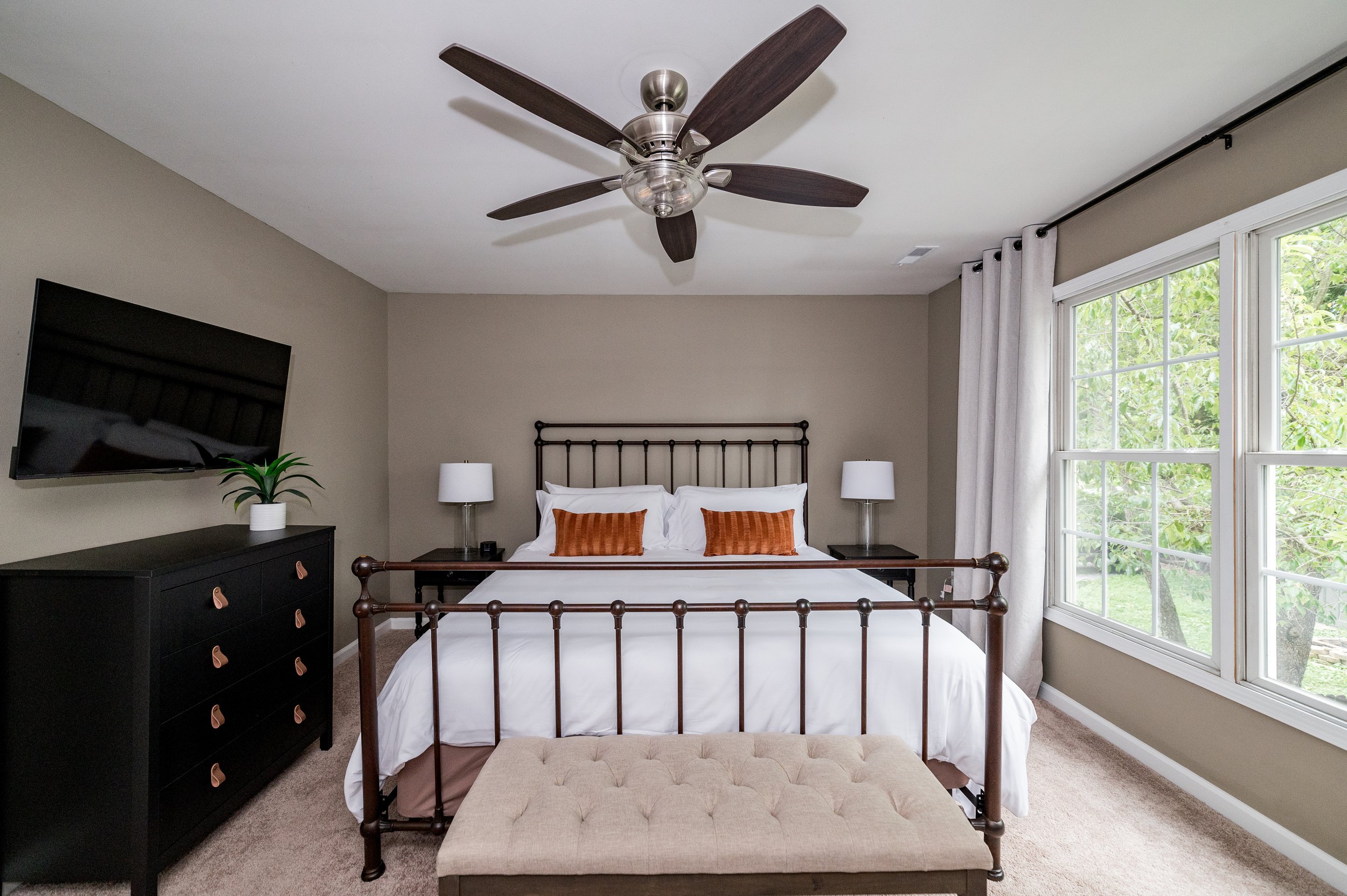
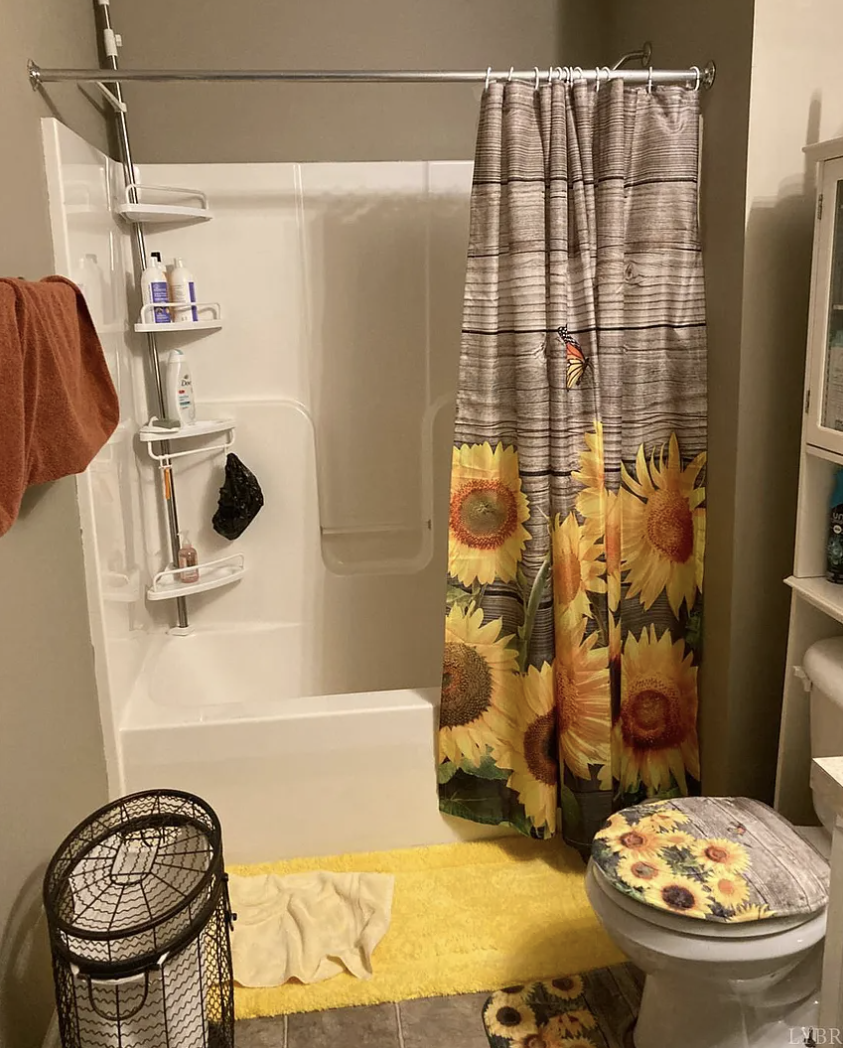
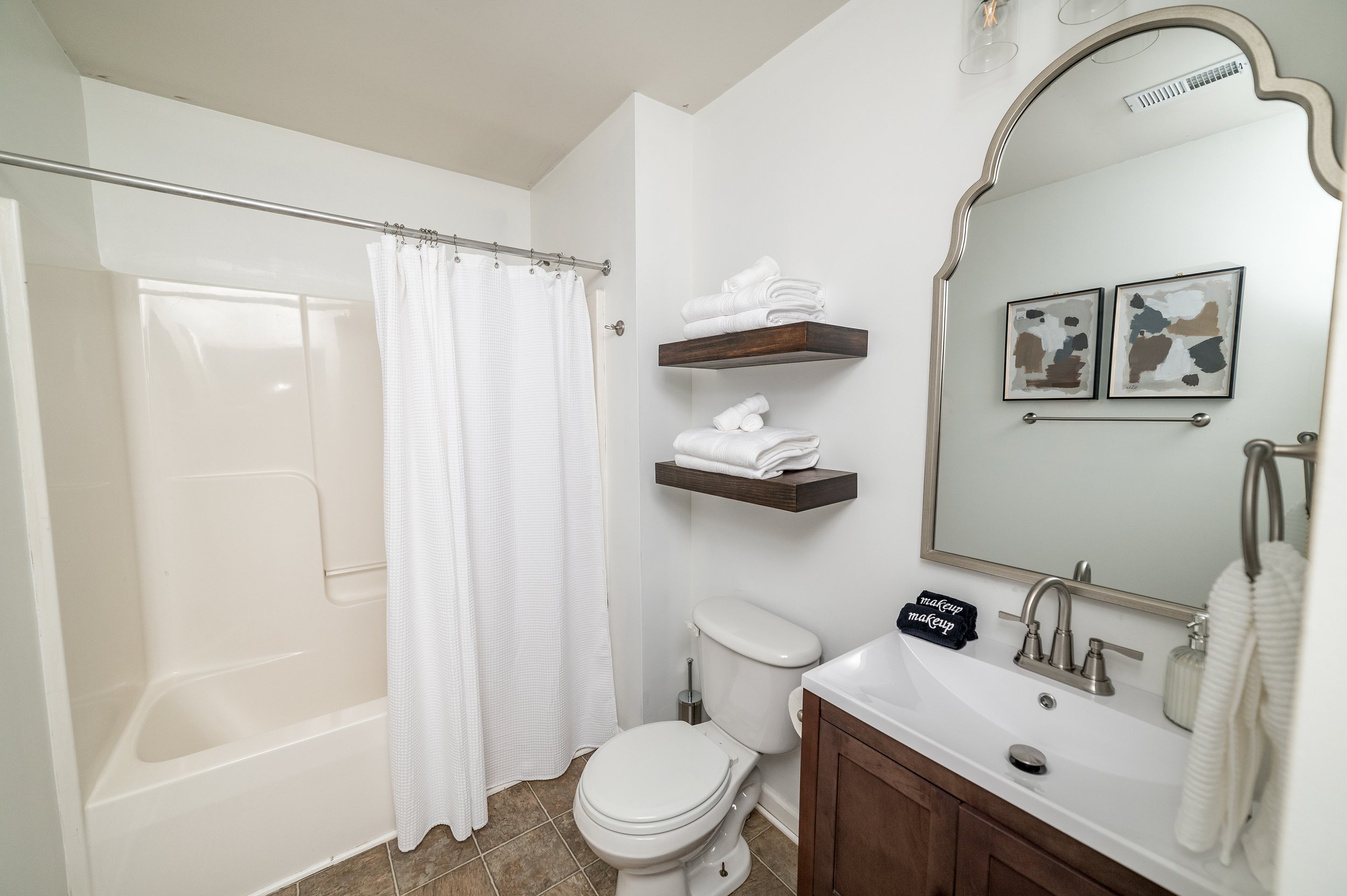
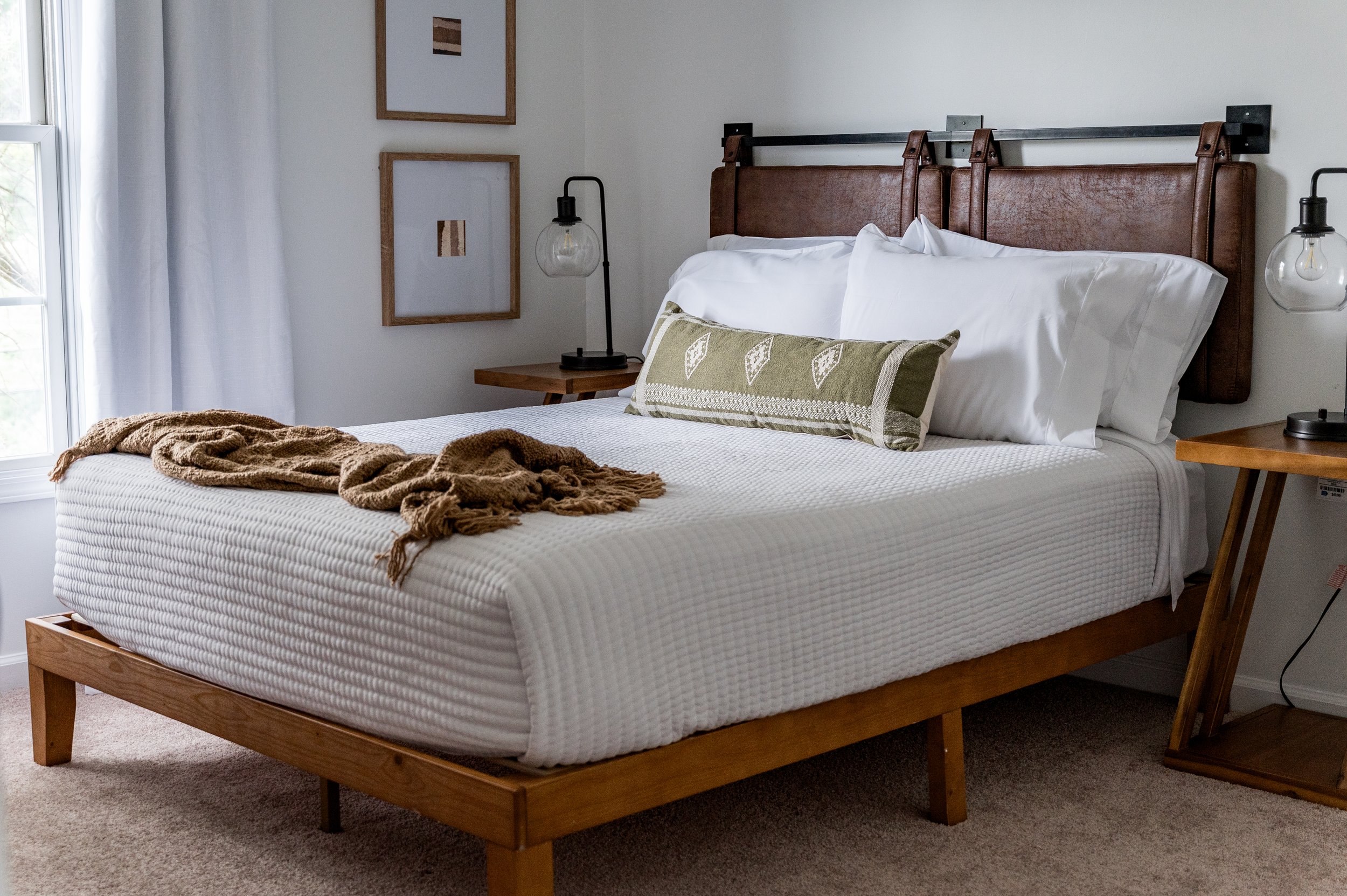
As much as I love white walls now (they’re all the rage), I decided to keep the taupe paint color in the primary bedroom and lightened up the bedding and window treatments. For the bathroom, we opted for white walls to make it look fresh and clean.
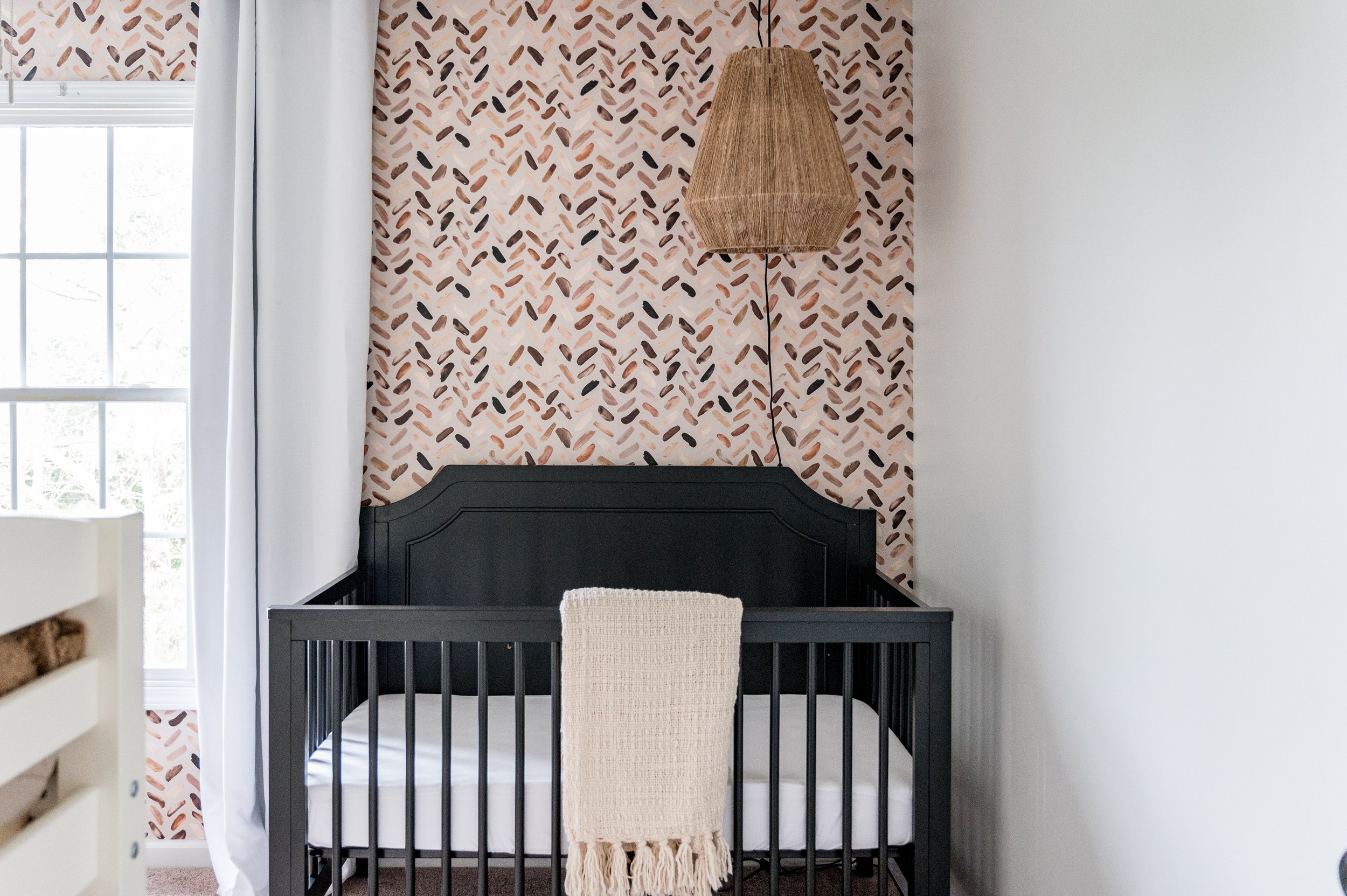
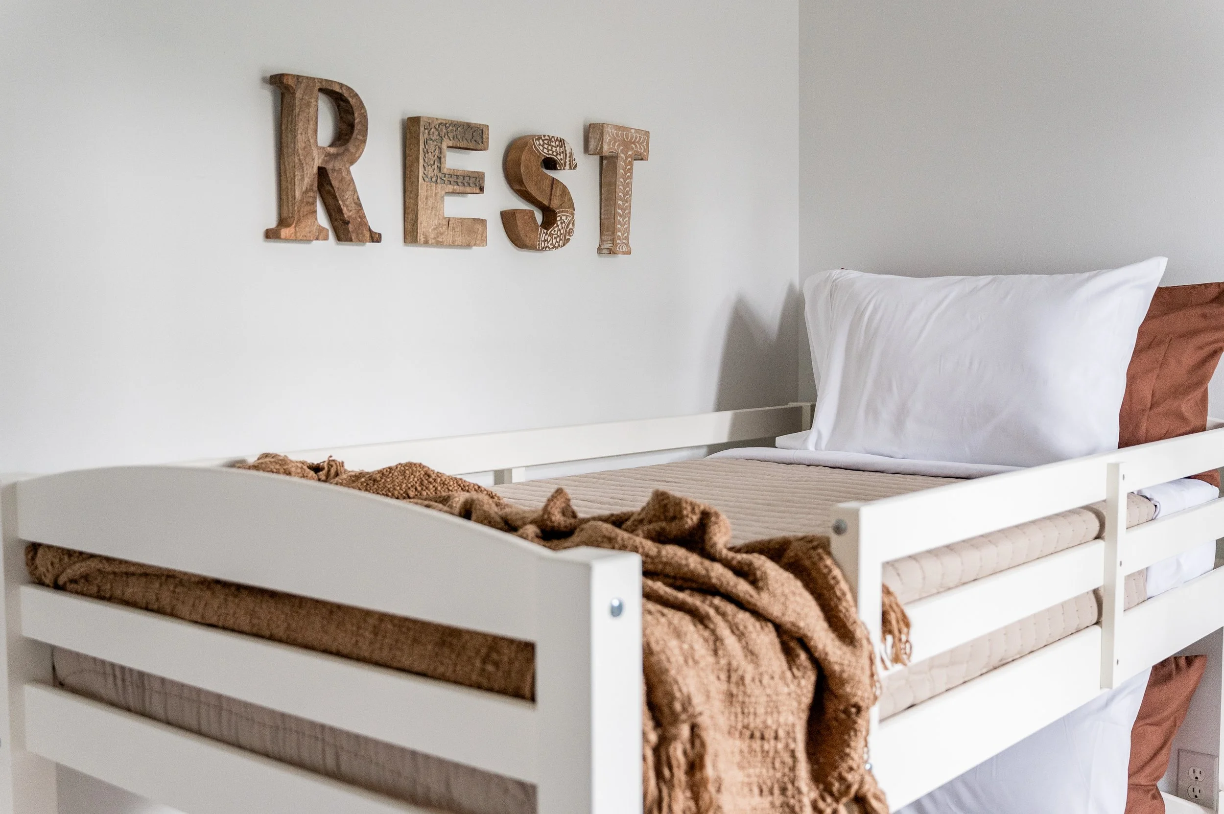
The other 2 upstairs bedrooms got fresh coats of white paint plus we added an accent wall of flesh-tones wallpaper behind the crib.
I’m really happy with how this home turned out. I hope it will be a haven to many families.
But man, this house taught me so much as a business owner.
Things took way longer than expected, I made silly mistakes in ordering, and we couldn’t get contractors to help when we needed it. In my attempts to SAVE the owner money, it actually COST more money. Plus, I learned that installing peel-and-stick wallpaper is definitely not for me.
As a result of this project, we’re changing our processes and hiring better contractors to make future set-ups more efficient for our homeowners.
WIN, WIN.
You can see the entire home and book your stay at Hilltop here!
“We had such a great stay at Hilltop! We felt right at home! The house was super warm and inviting! It's perfect if you have kids and want a home to yourself!” -Jennifer


