Before + Afters: Village Home
I’m always a little on edge walking into a potential property that’s already furnished.
Will it be designed well? Will it fit our brand to bring it into the Collective? Will guests want to visit this space? Will I have to break the news to the homeowner that their property isn’t a fit?
When I visited Village Home, it was already running as a short term rental.
In my initial walk-through, I could tell it was about 80% “there" for our standards (see the pictures below), and with a few tweaks, it wasn’t hard to envision bringing this home into our Collective.
The furniture was quality, the design style was pretty consistent, and a few areas in the home didn’t need touching at all. I knew with some additional investment, we could kick everything up a notch and take this place to the next level for our guests.
Design is key when you’re talking about attracting guests to a short term rental.
Musical Chairs
One thing that excited me about this project for the homeowner was how many items could simply be edited or moved from one room to another. (Who doesn’t love “free”?) Just by shuffling some things around, we saved costs AND made the space more functional and beautiful.
Village Home Airbnb in Lynchburg, Virginia
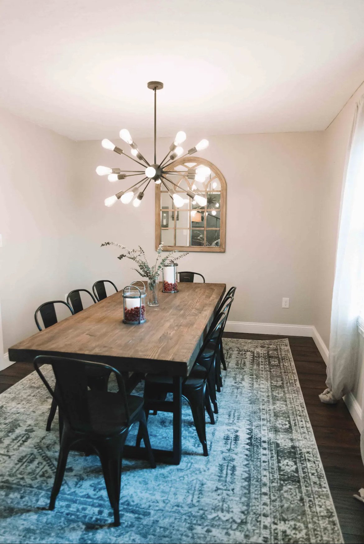
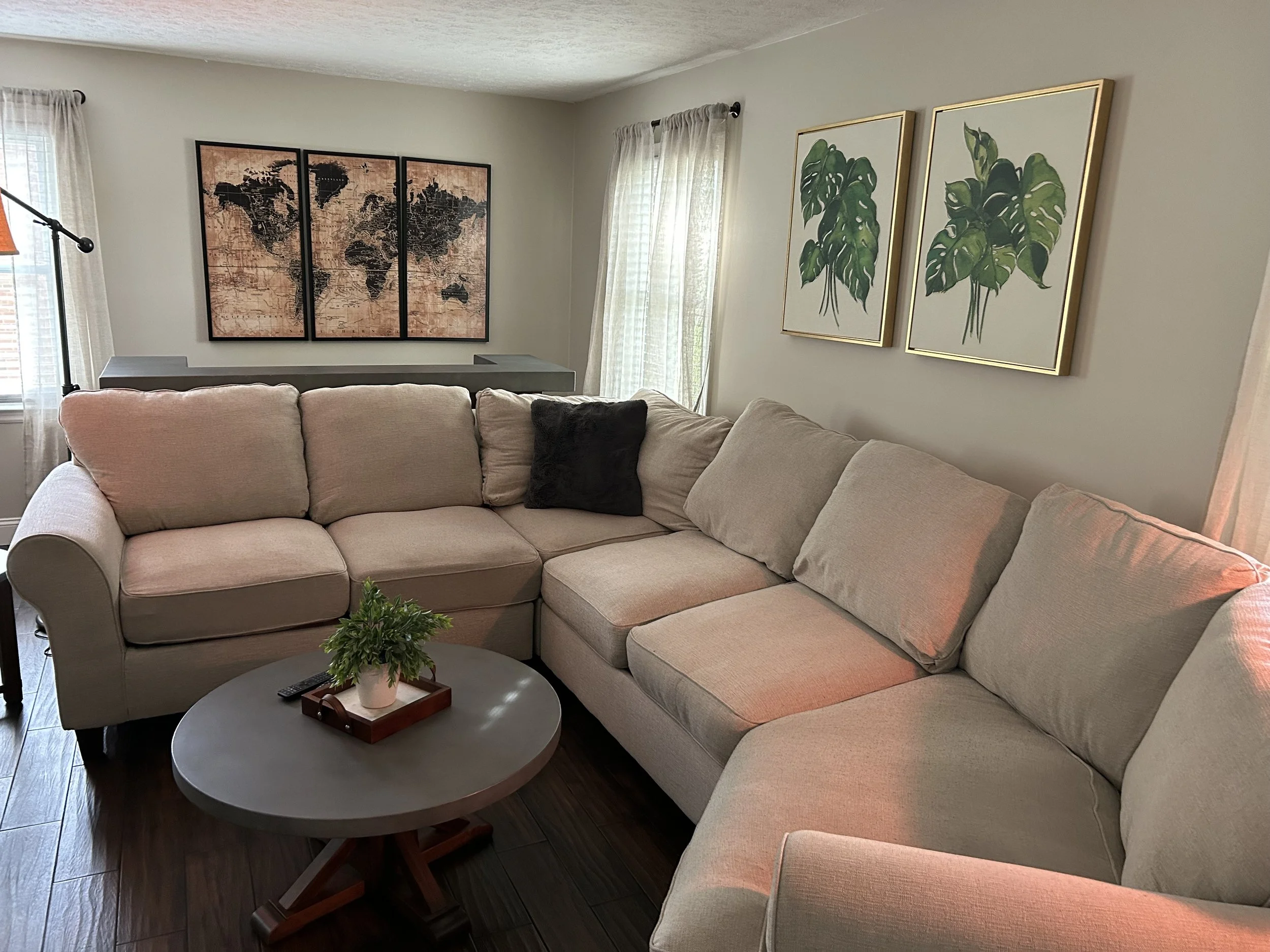
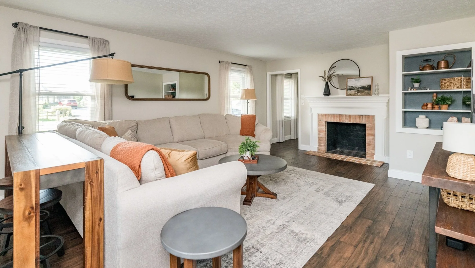
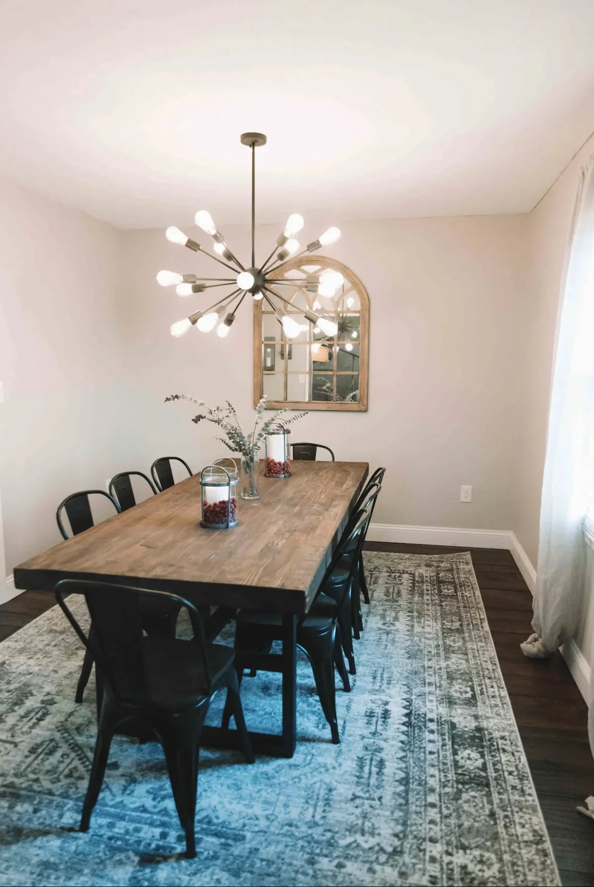
We moved the dining room rug into the living room. It’s my unpopular opinion that dining rooms don’t need rugs. (the thought of food falling on it grosses me out. Plus it’s just harder to clean.) Living rooms with hardwoods, however, NEED rugs. So it was a no brainer. And free. (Score.)
If you look at the previous art pieces, they filled the walls nicely, but there wasn’t a cohesive look or feel.
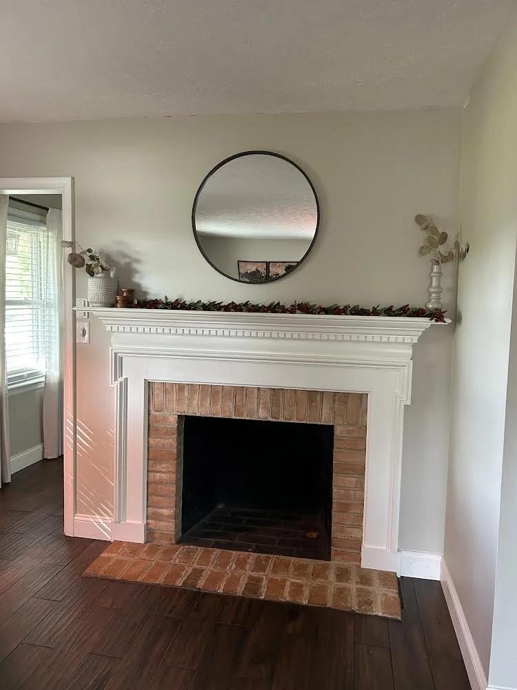
We were able to move the big map art piece to the entryway. (again, free) By turning a full size mirror on its side and finding a series of soft botanicals in an accent color, we were able to create a softer, more symmetrical look.
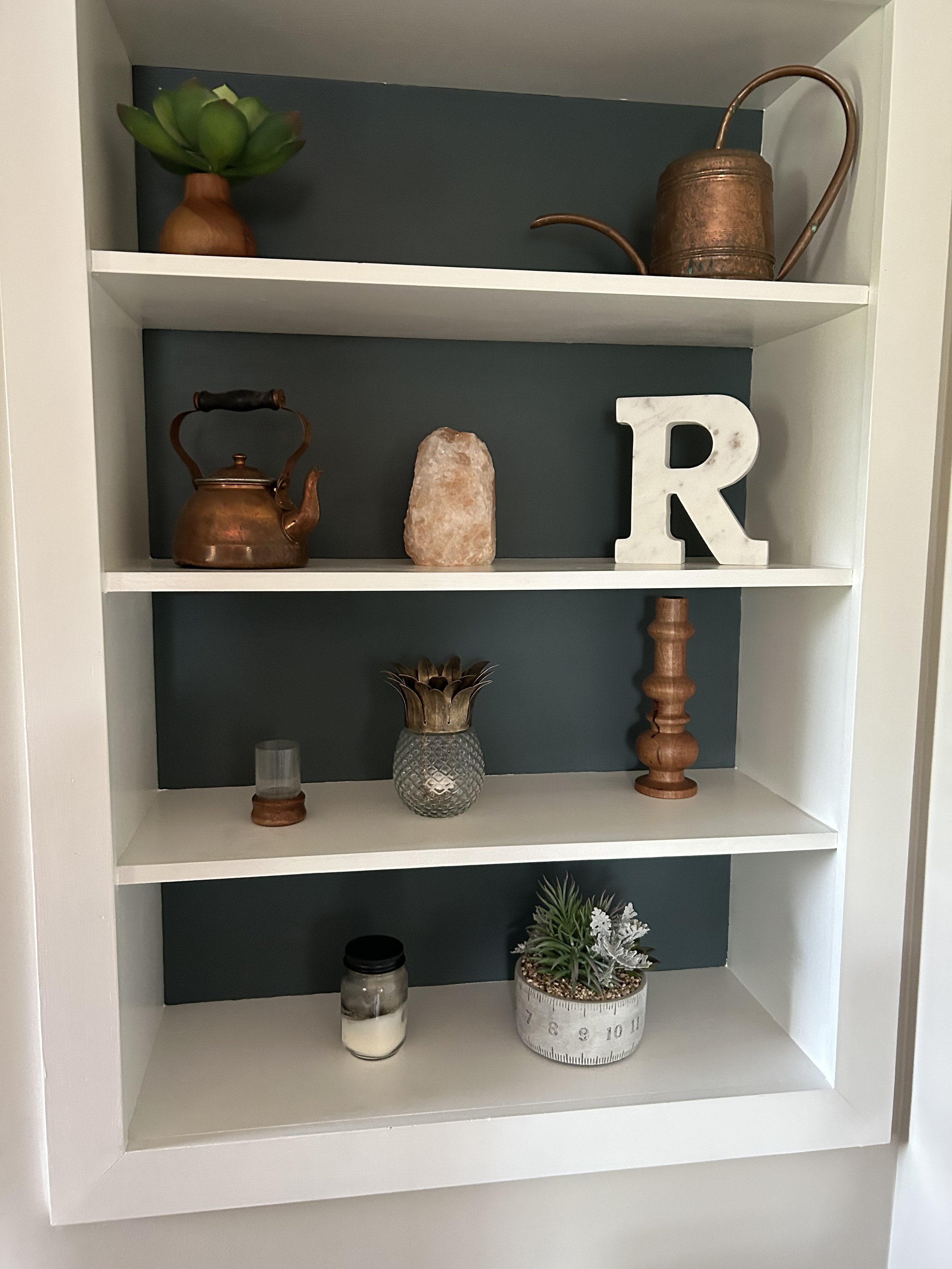
Before? The mantel was pretty bare and I personally wasn’t a fan of the red Christmas garland. (though we saved it for the holidays!) The shelves were filled with various knick knacks, which makes the minimalist in me a little sweaty around the collar. But by grouping many of the items together and adding a few extras, both the mantel and shelves feel more finished.
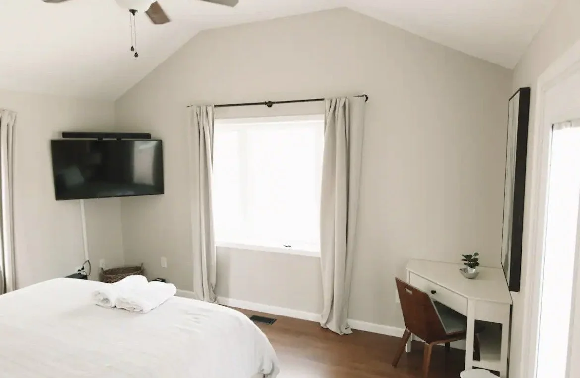
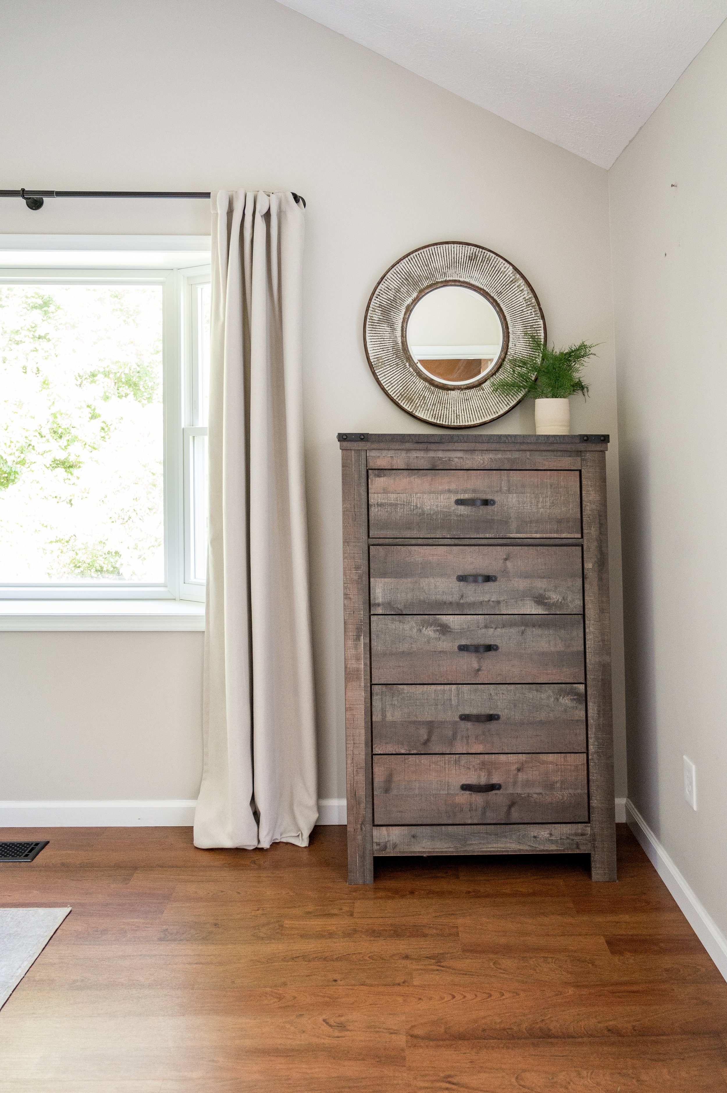
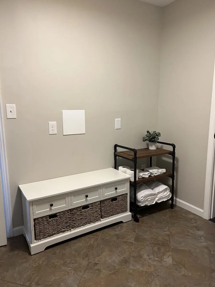
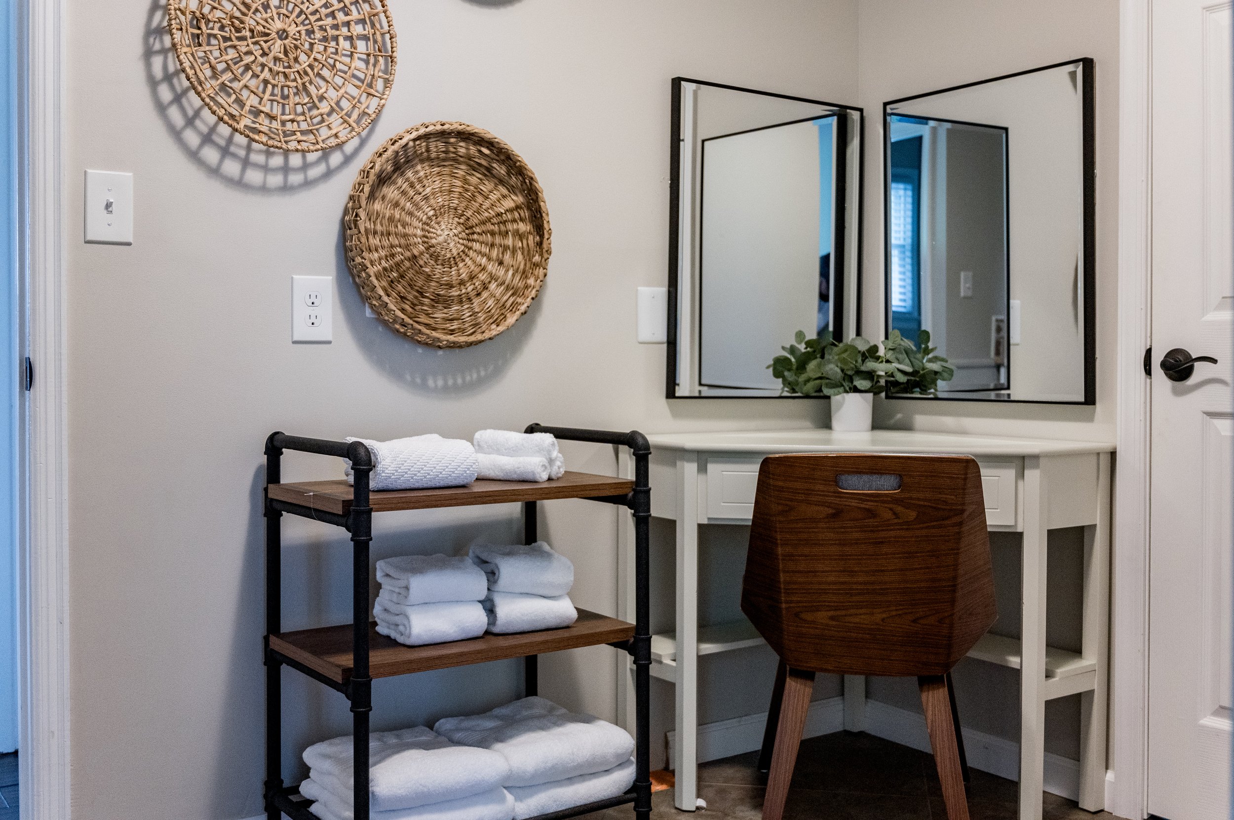
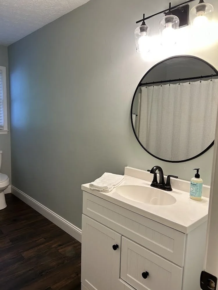
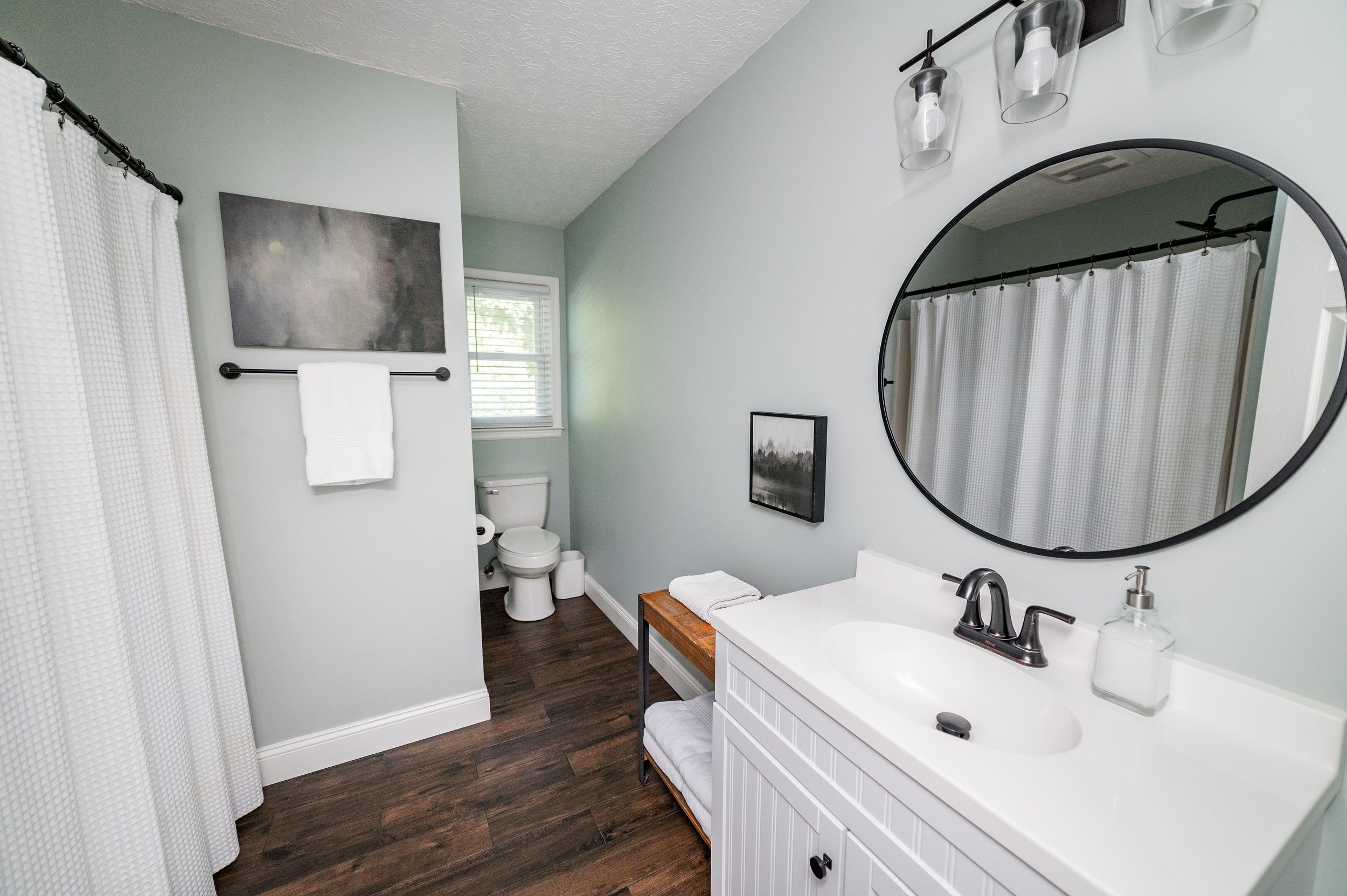
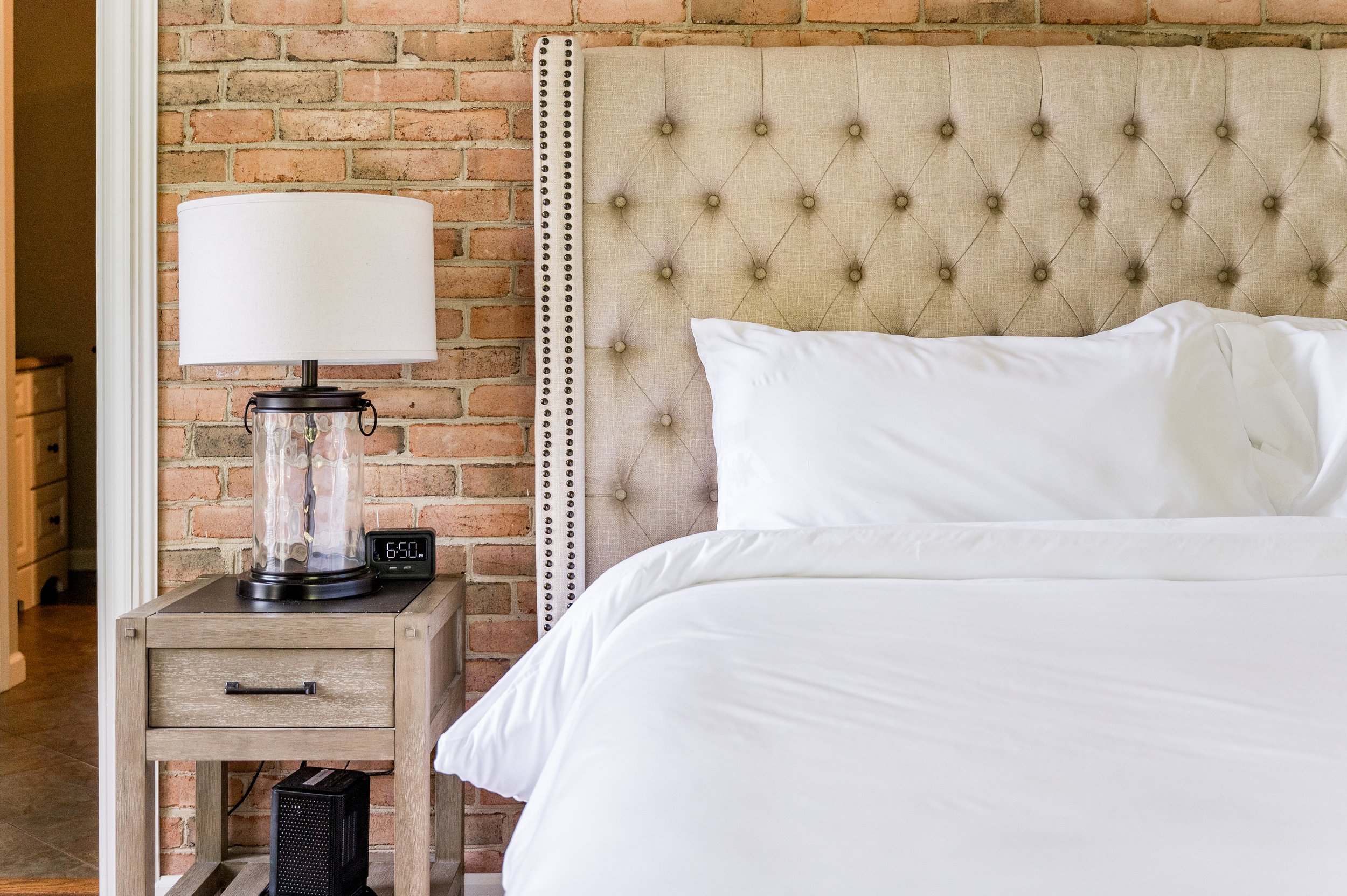
None of the bedrooms had dressers, which is a necessity for short term rentals in my book. It was time to upgrade. See that lonely corner desk in the primary bedroom? By moving it to the bathroom, we transformed an awkward corner into a personal vanity. (and that white bench? It’s sitting under the map artwork in the entryway! Because… free.)
The Biggest Change: the Kitchen
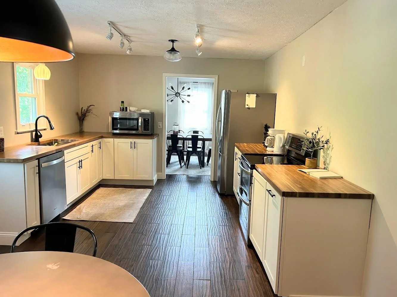
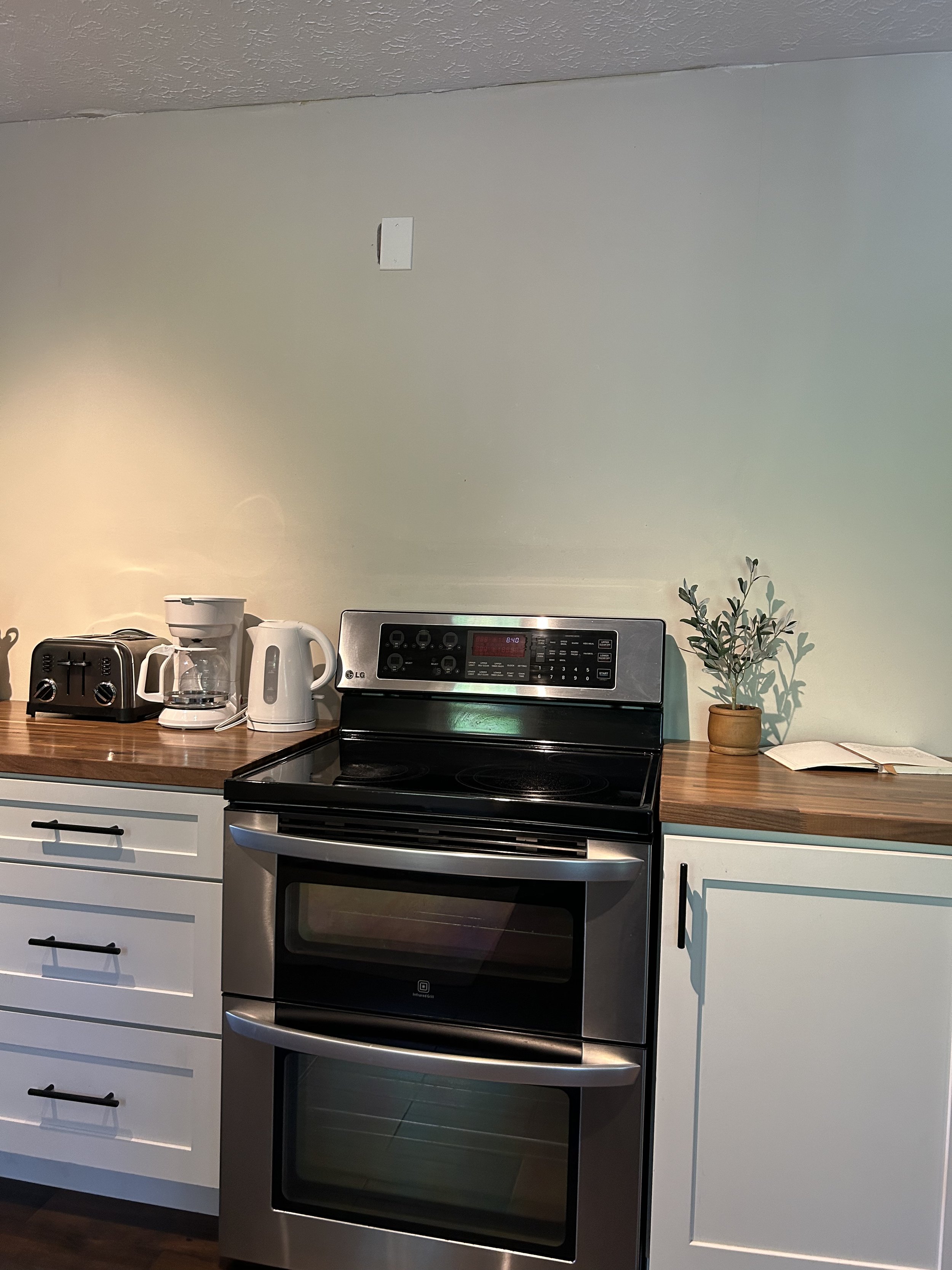
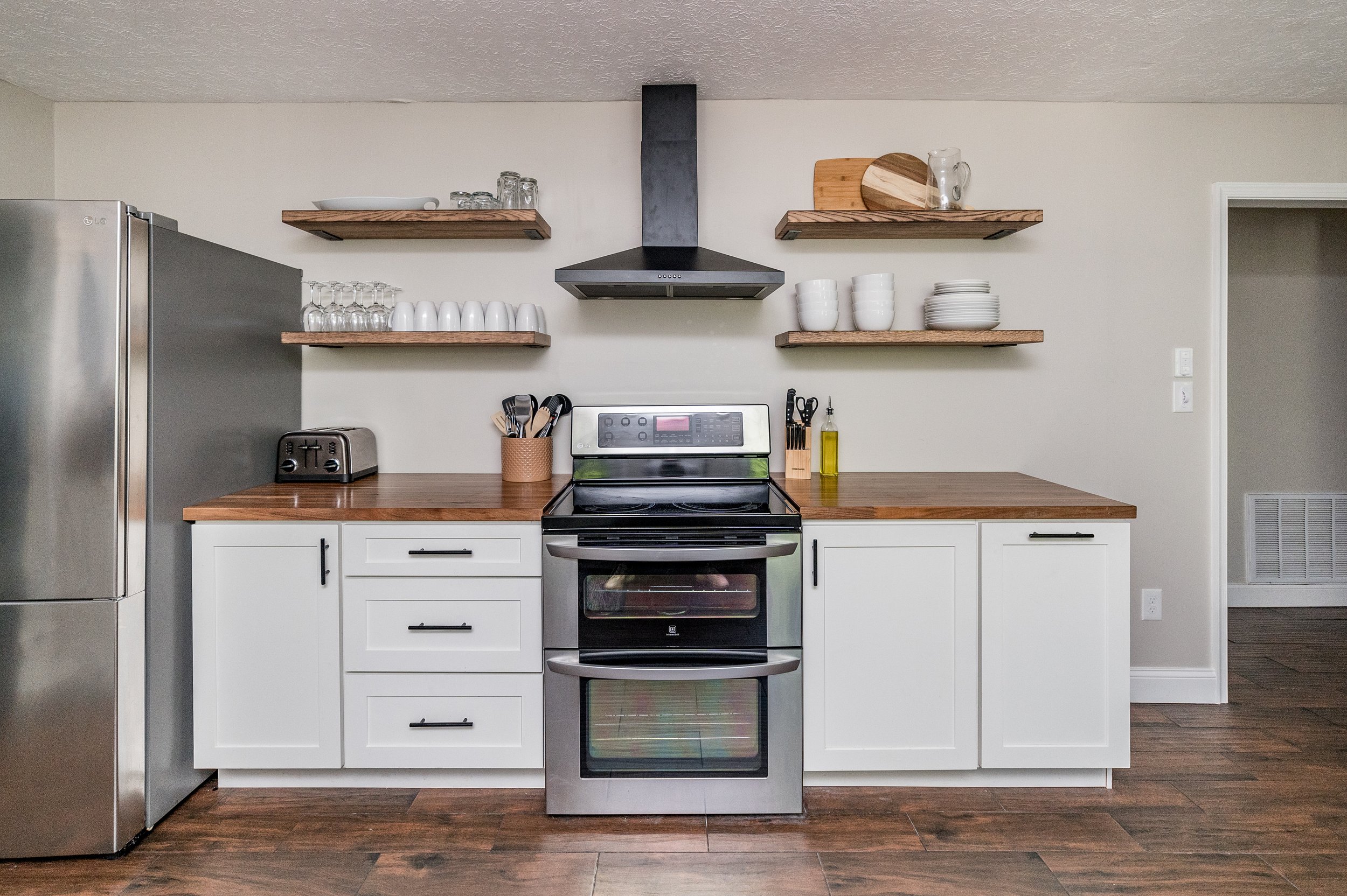
When I first stepped into the kitchen, I had immediate safety concerns seeing an operating stove with no vent above. (Guests had also mentioned the “unfinished kitchen” in public reviews.) The microwave sitting on the counter was an over-the-stove model that was literally burning the wood countertops beneath. (eek!)
So in our commitment to guest safety, this kitchen not only needed a decor facelift, but an operational one as well.
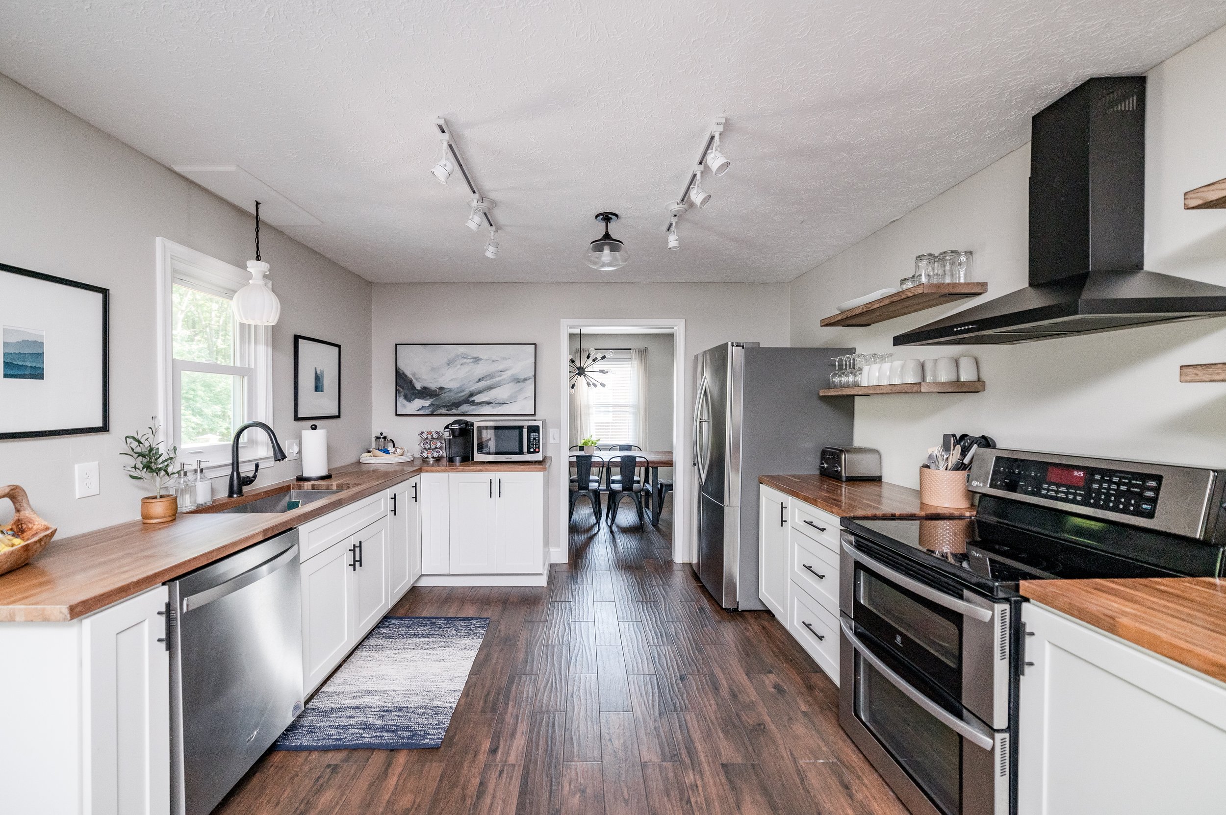
Installing a hood vent with floating shelves and switching to a true countertop microwave wasn’t optional. Floating shelves in kitchens are ideal for short term rentals because guests don’t have to go opening every cabinet to find what they’re looking for.
See that artwork we hung over the microwave? Guess what? Yep. Shuffled it from another room for free.
A Can of Paint
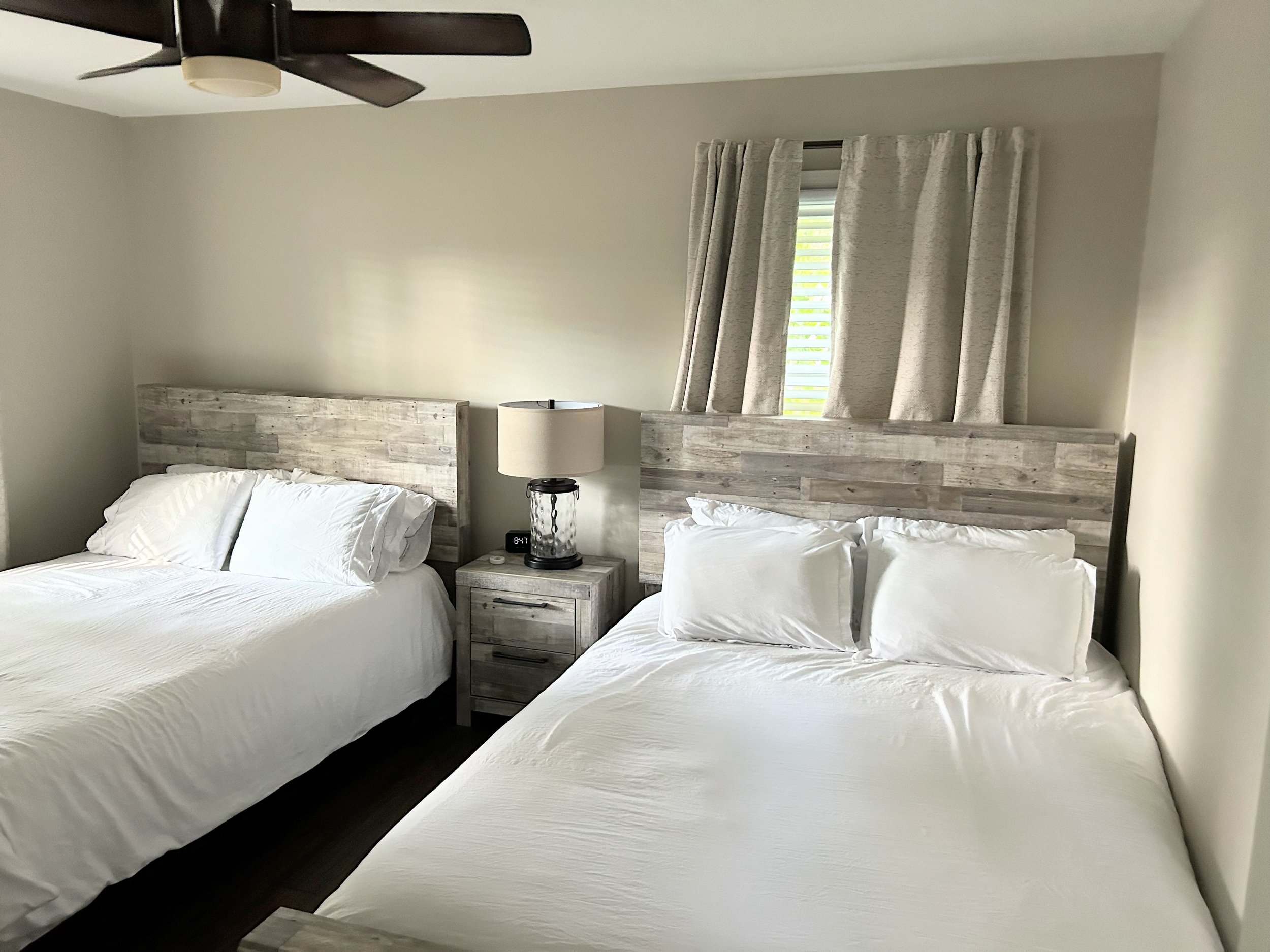
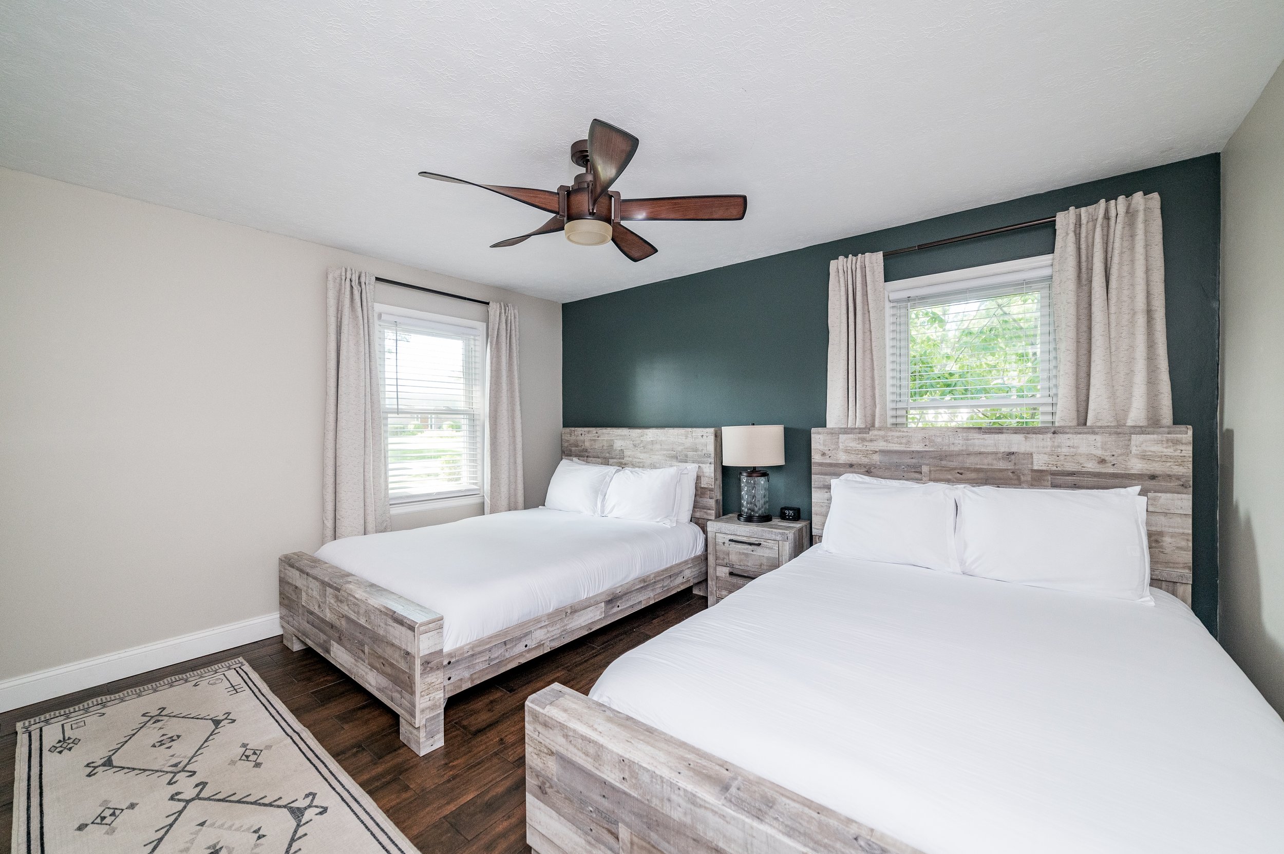
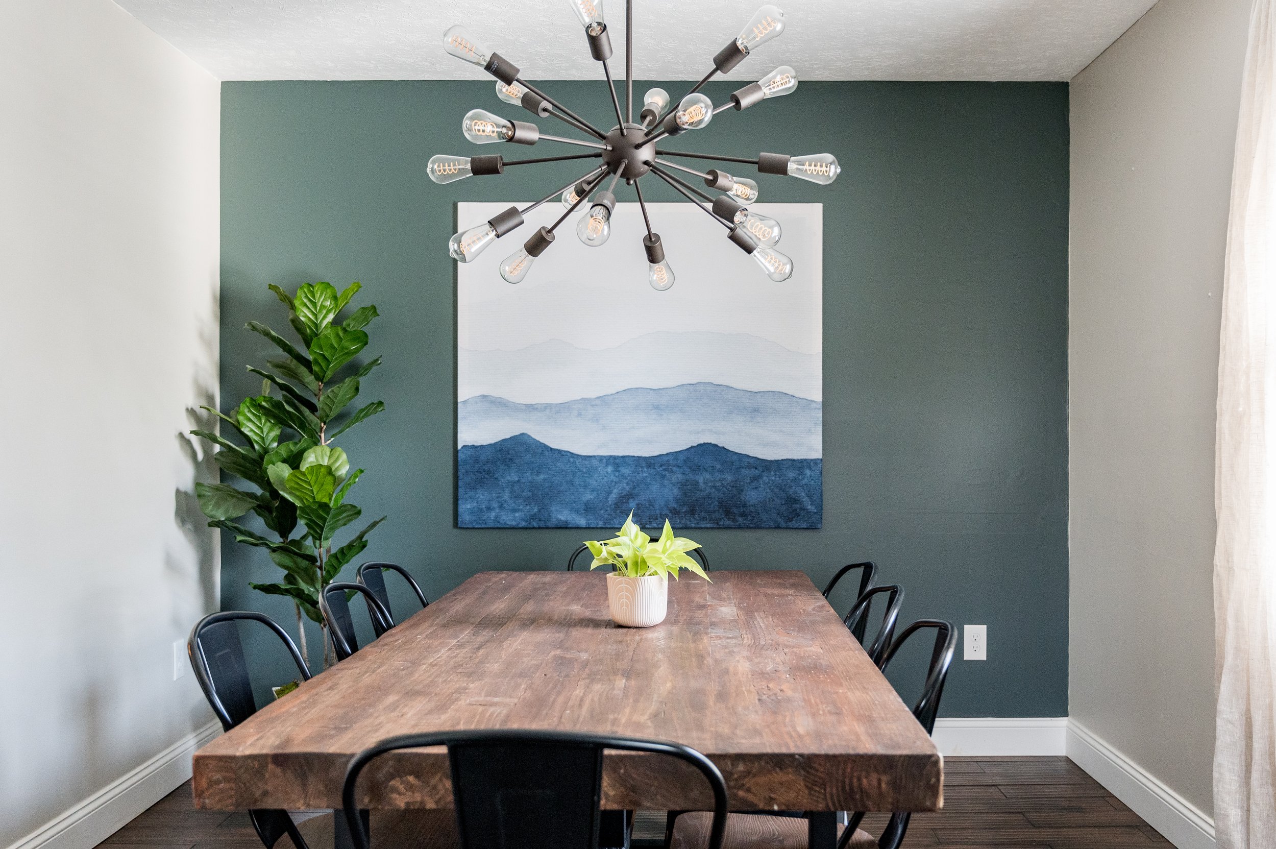
If you can’t afford to do much upgrading in your decor, changing a wall color is hands down the cheapest, most effective way to change the look. One of the bedrooms and the dining room were just boring and beige, so I recommended painting a focal wall in a paint color that I knew the owner already had.
We also hung the dining room mirror in one of the bedrooms that had no mirror and replaced with a simple wall tapestry from Society 6 that we stapled to a simple wood frame.
Towels + Bedding
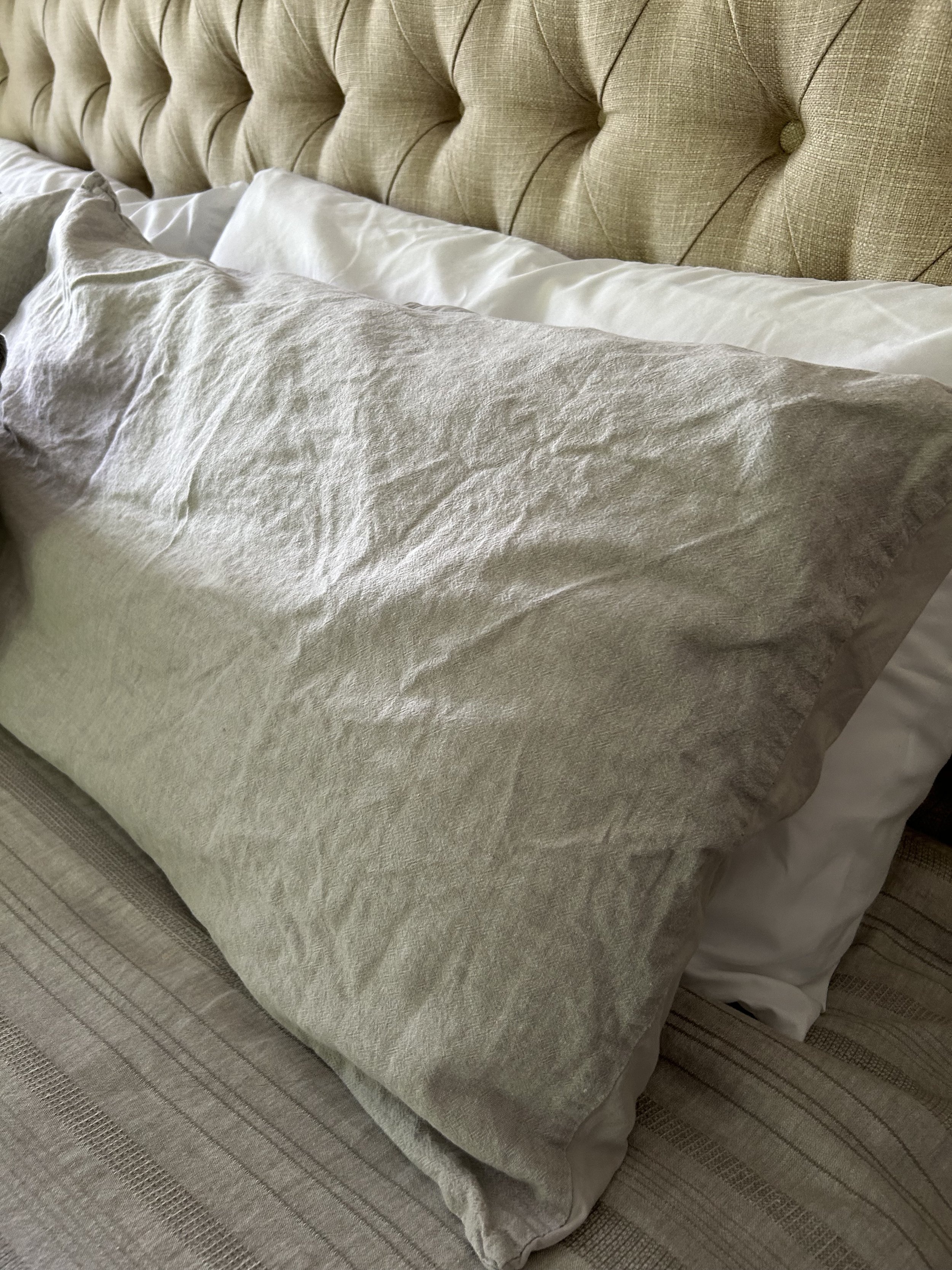
The subject of towel & bedding color is a bit controversial in the short term rental industry. We’re big believers in white towels and bedding to make our spaces look fresh and clean.
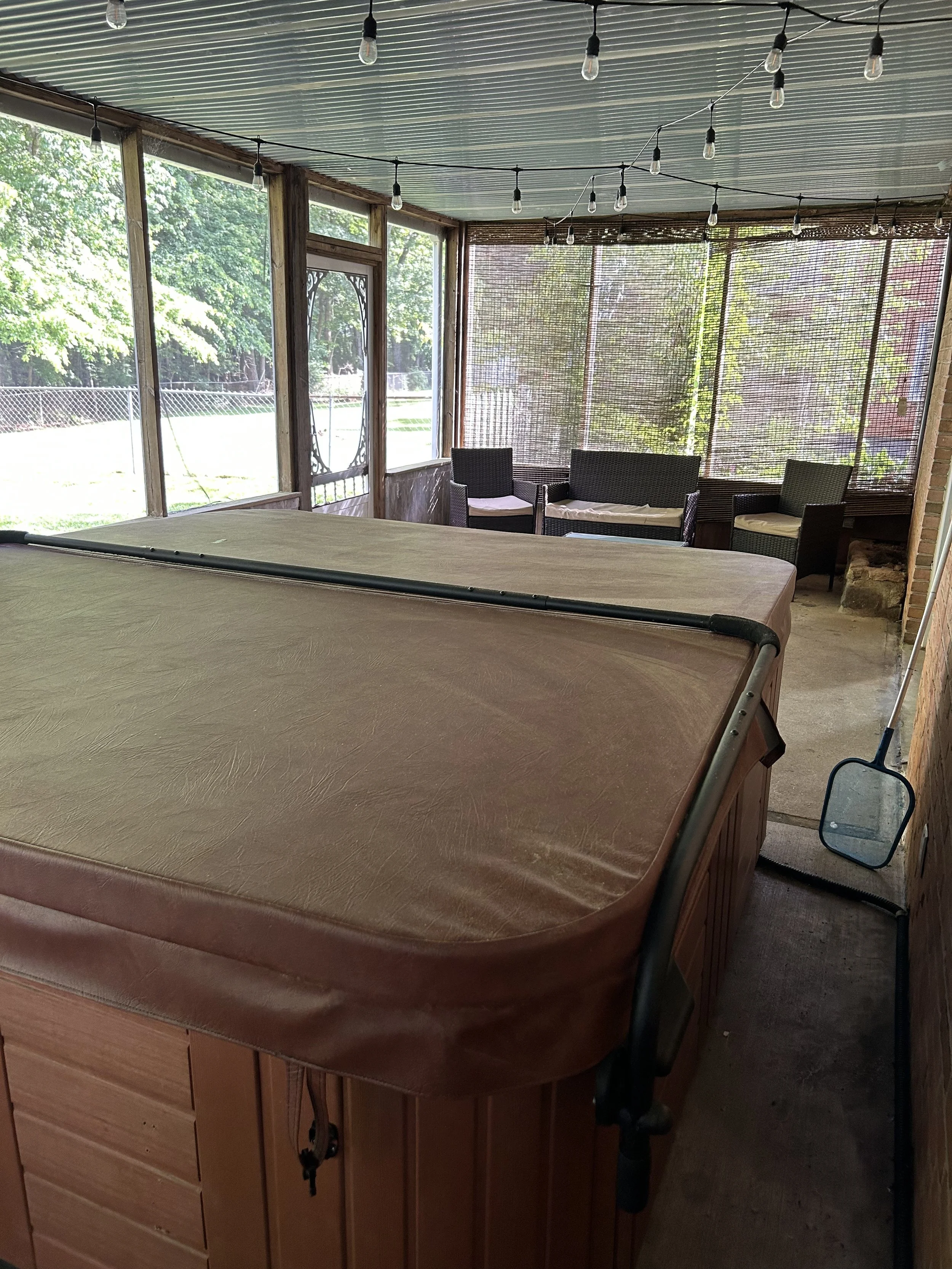
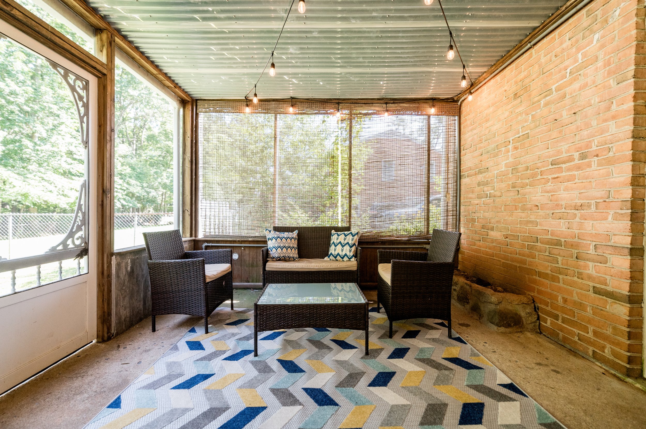
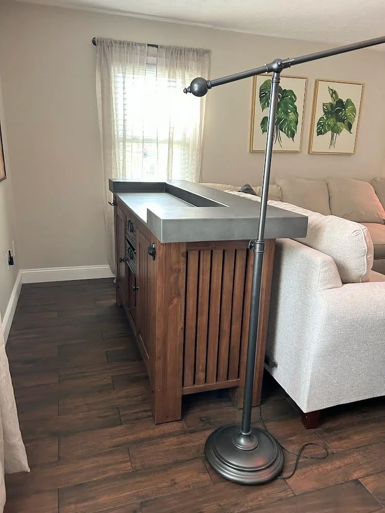
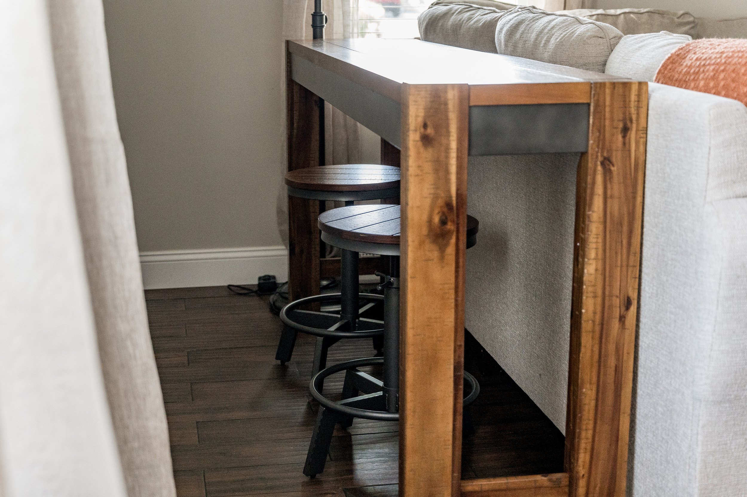
We didn’t have room in the budget to upgrade the furniture in the screened-in hot tub area, so we gave the “sea of brown” a little love with pops of color. And in the living room, we opted for a slimmer console table with stools behind the sectional so guests can eat while they watch TV. (Once the basement is renovated, you’ll see that larger bar table again!)
With its new amenities and facelift, we’re now proud to offer Village Home in the All Belong Collective.
Ready to see the finished product?
See all the pictures and book your stay on our website & save the service fees!

